Recently I was invited to talk to the computer science students at John Monash Science School by their wonderful teacher and all round superstar, Dr Linda McIver. The students had been working on different ways to show climate change data, Linda told me. Could we talk about that?
A chance to look at visualisations of climate data? How exciting! In five minutes I had a page full of examples to think of to share with the students. The presentation pretty much made itself.
When I got to JMSS, the student, teachers and I talked through 13 different ways to show essentially the same thing: the warming of the planet.
From the simple line graph, through maps and spirals, animations showing trends by country or latitude, and even crochet, we explored some of the many different ways to visualise climate change.
It was insightful to get feedback from the students on what they liked and what they didn’t, and why.
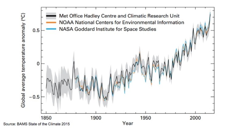
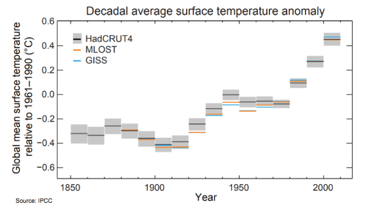
The annual time series, in general, was more well received than a plot showing decadal means, because it was easier to understand.
Red bars for positive anomalies versus blue bars for negative also went down well, plus we got to have a good discussion about what ‘average’ really means.

Maps showing trends were well received, although they might not convince policy makers to create change if their country was not the hottest.

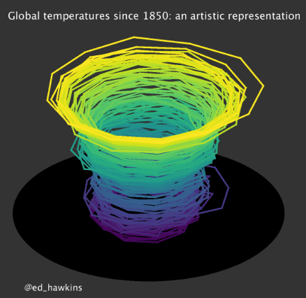
The glorious climate spiral received a big sound of recognition. Of all the graphs we looked at, it was the most well known (even more than the hockey stick!). Simple and mesmorising were words that came to mind, although perhaps not ideal for analysis.
In fact, most of the animated images we looked received good feedback, despite the complexity of some. It took us a couple of viewings to really understand John Kennedy‘s video of the temperature trend by latitude divided into land and sea for example, but the dramatic expansion of red post 2000 really made its mark.
We talked about the science behind the images, but also the aesthetics that make a figure fail or succeed in getting a message across. And some feedback was brutal!
Plots that were missing accurate labels, or were too confusing were stamped as such. “It’s a bit boring” for grey plots. “It doesn’t look very scientific” for a plot that graced the cover of the Daily Mail. “This one doesn’t seem as serious because there’s not much red, so I don’t think it would convince a politician to act”.
After the discussions, several students told me about the different methods they’ve been working on to visualise temperature and sea level rise.
Not only was I impressed by their Python skills, but also the imagination used to communicate science accurately and with flare. No spoilers, as I’m sure many will end up as viral sensations.
It also struck me how incredibly scary it must be to engage students with this topic so closely, as some of them may be alive to see the 2100 projections play out in their world.
Many thanks to Linda and the JMSS students for having me – I will definitely have their voices in my head next time I prepare a graph.
—
The full presentation can be found on Google Slides.
